The OnQ logo is the foundation of our brand identity. It represents our commitment to elevating the in-store experience through thoughtful design, innovation, and precision. Bold yet refined, the logo is built to perform at any scale and clearly signals OnQ wherever it appears.

The Q Logo

The Q logo is a secondary brand symbol used to reinforce recognition and continuity. It may be used independently in approved contexts, but it is not intended to function as the primary OnQ logo.

Logo Usage

Use the OnQ logo on white or lighter backgrounds with the black box behind the white Q whenever possible. When applied to dark backgrounds or imagery, use the version with the white box and black letter Q for maximum contrast and legibility.

OnQ logo on white backgrounds

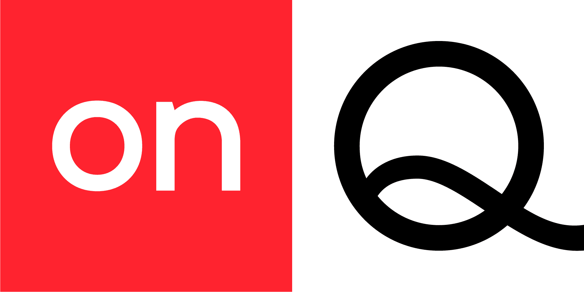
OnQ logo on dark backgrounds

Primary Color Palette

OnQ Red anchors our color palette, delivering clarity, consistency, and strong brand recognition.

OnQ Red

C4 M100 Y92 K0

R255 G35 B47

HEX: FF232F

White

C0 M0 Y0 K0

R255 G255 B255

HEX: FFFFF

Black

C60 M40 Y40 K100

R0 G0 B0

HEX: 000000

Secondary Colors

Secondary colors are used to create hierarchy and clarity in presentations, graphs, infographics, and charts. They should support the primary palette and be used sparingly to organize information without overpowering the brand.

Dark Blue

HEX: 0A0C1E

Light Blue

HEX: 0068DC

Light Grey

HEX: F0F0F0

Grey

HEX: 999999

Matte Black

HEX: 141414

FOR THE LOVE OF RETAIL

Typography

Poppins is the primary typeface used across the OnQ brand. Its versatility and extensive weight range enable clear hierarchy and consistent expression throughout our system.

Hierarchy

Tracking

Typesetting Notes

Hierarchy


Extra Large Headline
Extra-large headlines are used selectively and do not appear in all standard documents. They are typically reserved for presentation covers, section dividers, and physical signage. Extra-large headlines should be set in Poppins Semibold, in all caps.


Headline
Poppins Semibold is used for all external-facing headlines. Headlines should be set in title case for standard brand documents and sentence case for communications.


Subhead
Poppins Medium is used for subheads to establish clear hierarchy and structure. Use title case for standard documents and sentence case for communications.


Body Copy
Use Poppins Regular for body text, captions, and detailed content to ensure readability and consistency across all applications.

Hierarchy

Tracking

Typesetting Notes

Hierarchy


Extra Large Headline
Extra-large headlines are used selectively and do not appear in all standard documents. They are typically reserved for presentation covers, section dividers, and physical signage. Extra-large headlines should be set in Poppins Semibold, in all caps.


Headline
Poppins Semibold is used for all external-facing headlines. Headlines should be set in title case for standard brand documents and sentence case for communications.


Subhead
Poppins Medium is used for subheads to establish clear hierarchy and structure. Use title case for standard documents and sentence case for communications.


Body Copy
Use Poppins Regular for body text, captions, and detailed content to ensure readability and consistency across all applications.